
The Feminine and Masculine Side of Brass – 2013 Trend
February 9, 2013 § 1 Comment
Last fall my boyfriend worked on a documentary in Nepal about Pushpa Basnet who is the 2012 CNN Hero of the year. Pushpa runs a children’s center that provides education, housing and medical care to children of incarcerated parents in Nepal. Without Pushpa, these children would have to live in prison with their parents.
When my boyfriend returned from Nepal he brought back a number of little things, most of them being pretty brass somethings. My favorite being a golden brass singing bowl and a beautiful brass board game called tigers and goats. My living room now has a few brass accents and it has given it an added feeling of warmth.
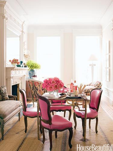
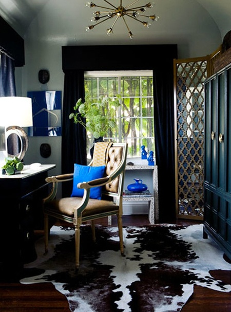
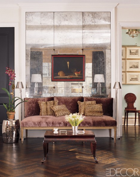
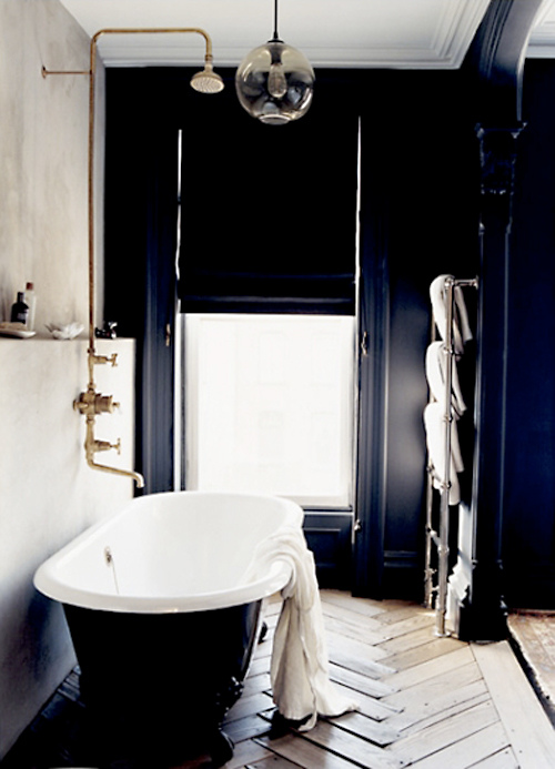
Brass is trendy once again, but is back in a softer form than before. Its adds an elegance that’s more understated than brass of the 80’s and 90’s. I especially like the mixture of black and brass, adding warmness to a masculine look. Brass is elegant and goes well with a number of styles, modern or traditional, feminine or masculine, and can be combined with various metals. I also love brass in a feminine room. The combination of pink, brass and white create a feeling of glam that makes a girl feel special.
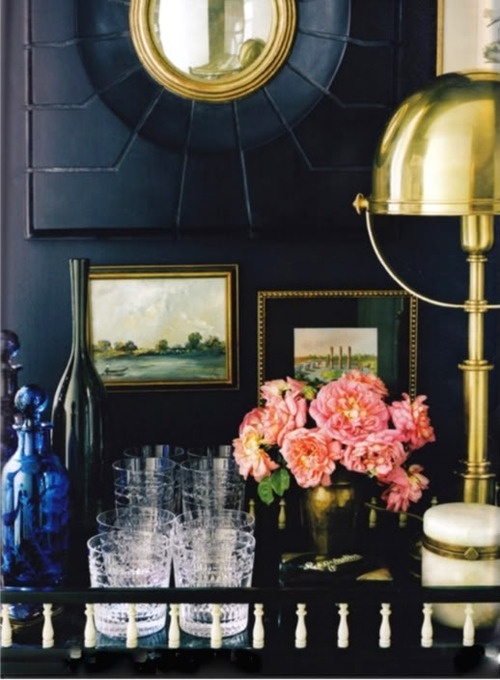
Bar with brass accents

Designer Suzanne Kasler

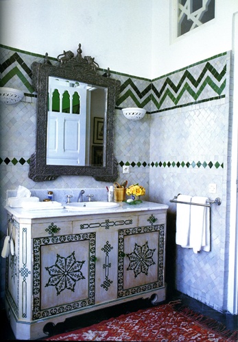
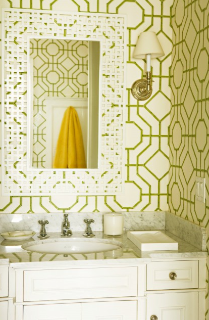
Traditional bathroom with brass hardware

Brentwood Regency Estate – Elizabeth Dinkel

Kelly Wearstler – home library in Mercer Island

Brass accents

Dressing room by Steven Gambrel
Living room by Jonathan Berger. Brass card table
Gabriel Hendifar office
Shaker cabinets with brass hardware
Color Inspiration – Mushroom Hunting
February 8, 2013 § Leave a comment
During the holidays I went back to San Francisco to see my family and of course, go mushroom picking with my father. Our mushroom of choice, chanterelles. Nutty rich golden goodness…
This year has been a surprisingly disappointing year for mushroom gathering, at least in Northern California. Last year we had around 100 pounds of chanterelles! After one gathering we had seven cookie sheets of mushrooms that were monopolizing the dining room table! This year I don’t think we even made it to a pound, but we did however find enough to make two lovely chanterelle pizzas.
Without the abundance of chanterelles, this year I focused more on the other pretty things in the forest and took this photo of a witches butter mushroom. I love the combination of the moss green, lichen green and tangerine orange. I think it would make a lovely color scheme in a room. I have always been inspired by color combinations in nature. If it naturally grows together in nature, it must be meant to be.

Witches Butter
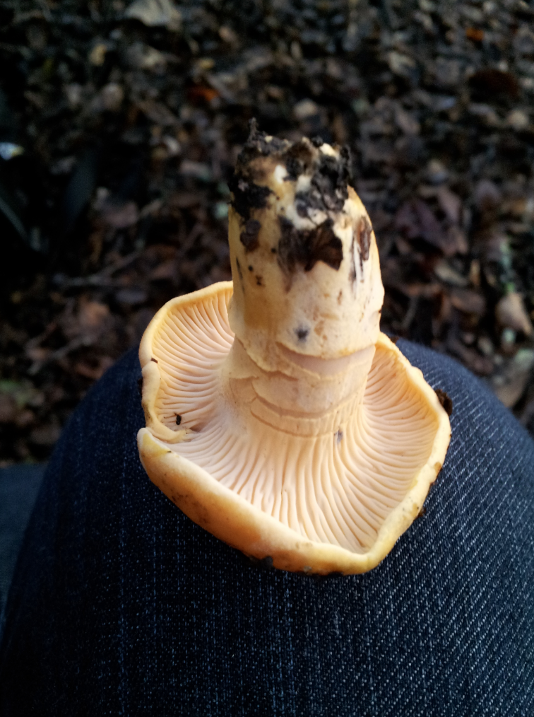
Chanterelle on my knee
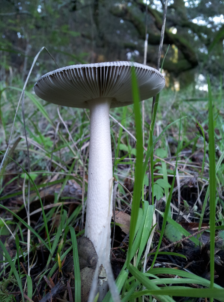
Gills of a mushroom
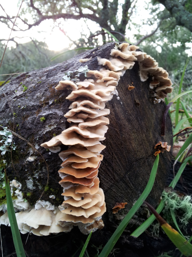
Young Turkey Tails
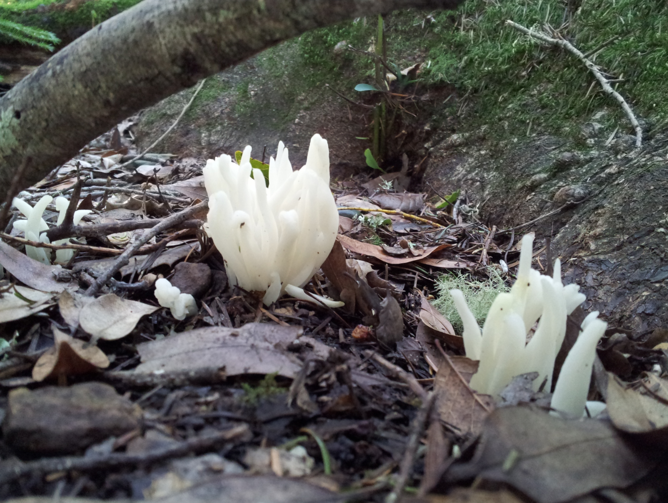
Coral Mushrooms
The Organization of a Fabric Library
January 19, 2013 § Leave a comment
A while back I reorganized the fabric library, stepping up the efficiency at the office by quite a few notches. Now that it has been a while, I can safely say that this method works rather wonderfully.
We dig through these drawers constantly, so excuse the mess.
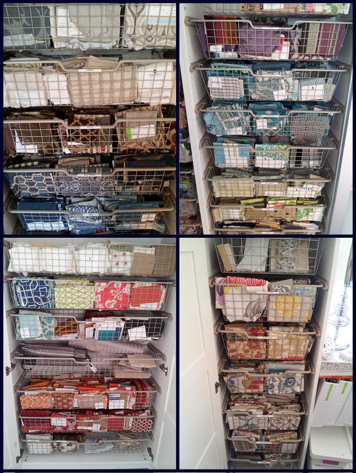
Fabrics are stored in labeled, pull out drawers and are broken down by color: blue, blue green, green, yellow, orange, neutrals, metallic, and so on. Fabrics with multiple colors are broken down by type, such as florals, geometric, ikat/abstract, stripes, embroidery, and probably a few others. Then there are outdoor fabrics, leathers and sheers. There was one client whose design was very brown and blue oriented, so the brown blue combinations have their own drawers.
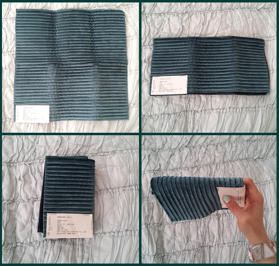
Fabrics are folded so that the fold is facing up. If possible, tags are on the outside, rather than folded in so that the vendor and pattern numbers are visible without unfolding. If the fabric is a stripe, the fabric is folded with the stripes vertical so you can see right away that it is a stripe. Fabric cards have there own drawer. If space allowed it, fabric cards would be broken into color as well.
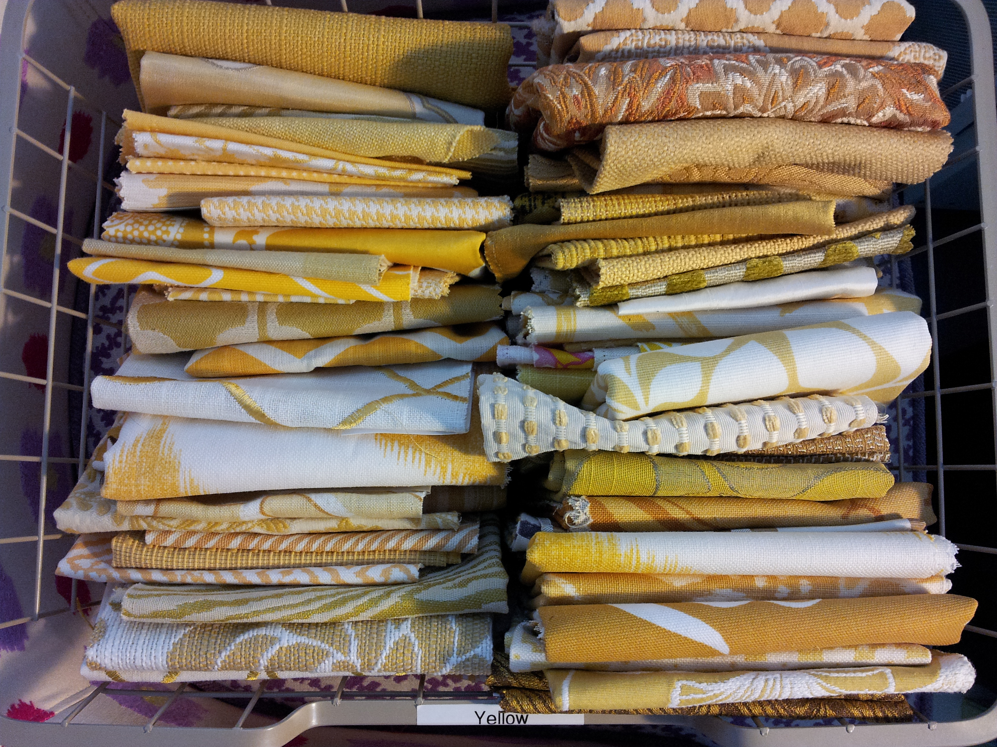
For me, this method is perfect. If I am working with a specific color scheme, and looking for say, something purple, I can go to the purple drawer, pull it out and set it on the work table to sort through and find what I’m looking for.
Lastly, there is a ‘go-backs’ box. Its actually an ottoman that has a top that lifts off. All of the fabrics that have been pulled out and are no longer in use go into the ottoman and later, our lovely assistant sorts through it and puts the fabrics back in their drawers. Voila, perfect system.
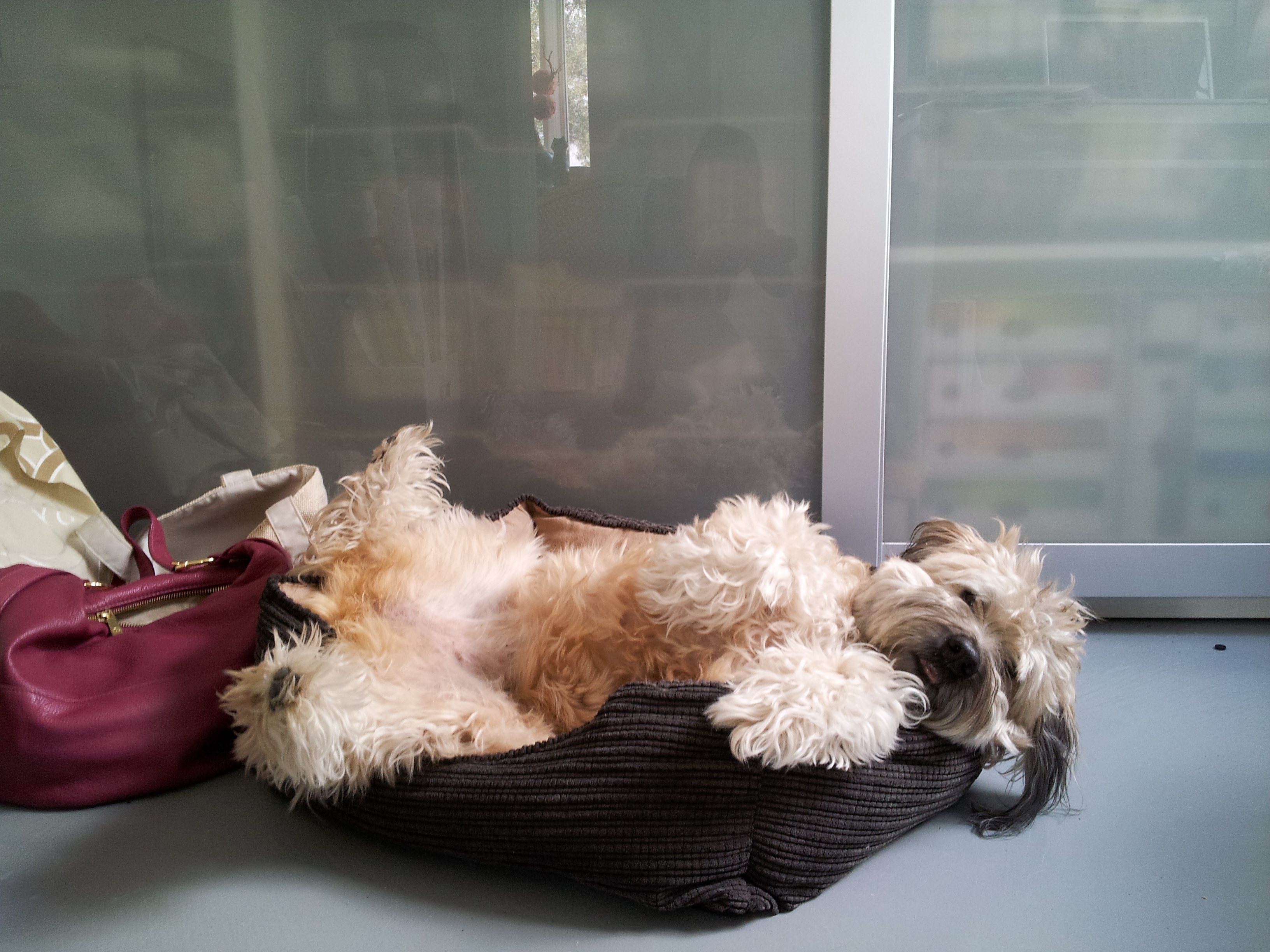
And this is my sweet Wheaten Terrier keeping me company at the office.
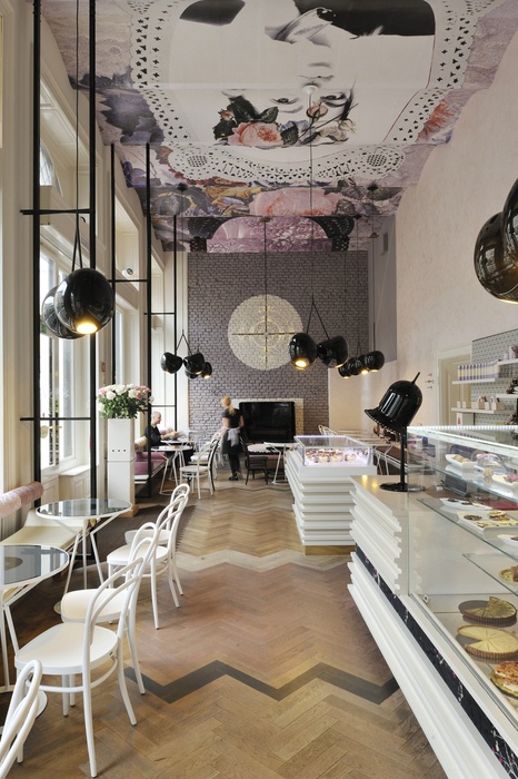
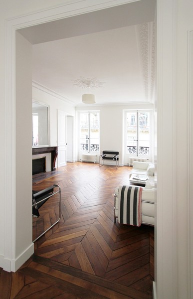
Lovely Herringbone Floors
January 15, 2013 § Leave a comment
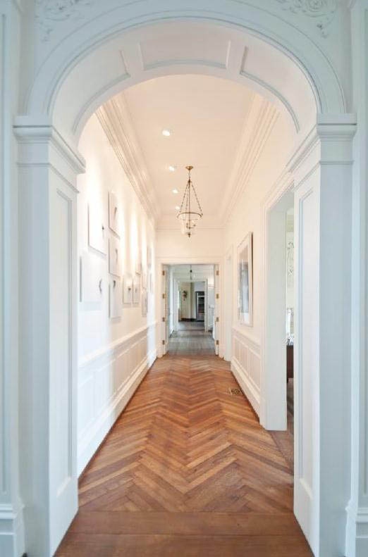
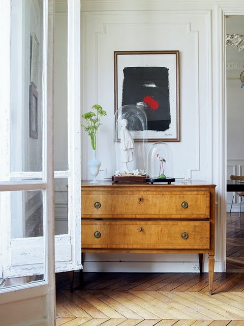
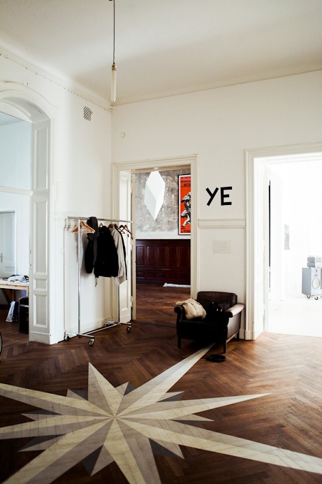
I have a design crush on wood herringbone floors, really herringbone anything. I’m especially fond of wide planked, slightly worn herringbone floors that make you think of beautiful French apartments, or more traditionally, European chateaus. I find herringbone patterns very elegant, yet masculine, which strikes a nice balance.
Todd Romano
Herringbone and chevron patterns are often used interchangeably but they are not the same, although I do love both. The herringbone pattern has staggered planks where as the chevron’s planks meet at a center line. Chevrons are cut on the diagonal while herringbone is not.
Chevron vs. Herringbone
![]()
![]()

Alberto Pinto
January 14, 2013 § Leave a comment
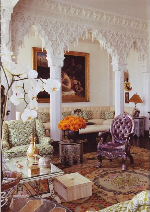
A designer born in Argentina and based in Paris was a recipe for one unique and beautiful style. Alberto Pinto’s designs were luxurious with rich, bold color schemes, over scaled patterns and a Middle Eastern flair. He had an eye for mixing different patterns and styles of various eras, making for a interesting, layered design that I find so appealing. I am especially inspired by his comfort with color and his details. I love the details, in any design, and Alberto Pinto does a beautiful job, especially in the details of doors, cabinets, windows, molding and so on.
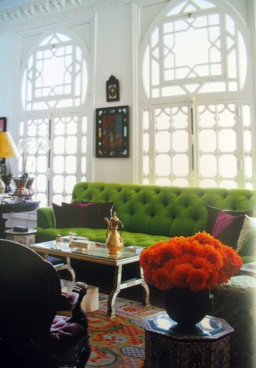
I love the detail of the windows and the bold green sofa.
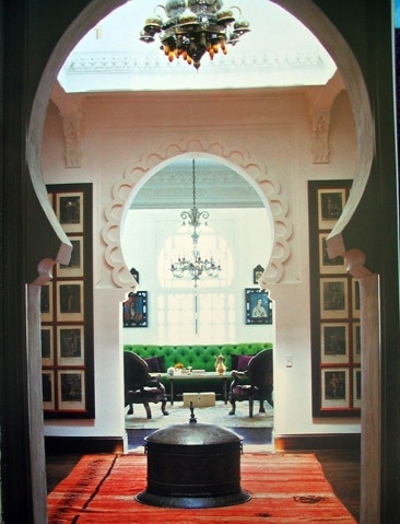
Architectural details
Mixing patterns
Eastern meets Victorian meets English
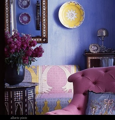
Pinks and purples nicely done

Door and cabinet details
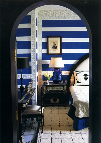
Bold stripes and molding details
Something to make you go aah
September 11, 2012 § Leave a comment
Peach and moss.. What a beautiful, bold, color combination!
I find this such a happy space, one that could quite possibly keep me from ever leaving. It is simply a feel good room.
It is refreshing to see the bed floating in the middle of the room, and a wise design choice to frame it with a rug and chandelier. And that wallpaper! I have a thing for watercolor like fabrics, wallpapers and so on. This wallpaper is by Black Crow, other beautiful wallpapers are made by Porter Teleo and can be customized.
Designed by Robert Passal for Traditional Home Magazine’s Hampton Show House.

Wallpaper by Black Crow
Upholstered bed frame fabric by Schumacher (Gainsborough Velvet in Apple)
Side table by Stephanie Odegard

aaahh
Fun Power Rooms
August 10, 2012 § Leave a comment
Powder rooms are a good place to let loose and add a little extra creativity as less time is spent in them than other rooms; so don’t be shy and put up the wallpaper!

Woodson & Rummerfield’s House of Design
Elizabeth Dinkel Design Associates

Sara Ingrassia Interiors

Niche Interiors

Via Elle Decor

Melissa Miranda Interior Design

Martha O’Hara Interiors
Brilliant Design Solutions for the Kitchen
May 20, 2012 § Leave a comment

This is my favorite. Absolutely brilliant! And I thought a “scrap bowl” while cooking was a good idea. You could even do this yourself!

The end to reaching dishes from shelves too high and the difficulties of trying to grab 5 plus dinner plates at once. Gravity is with you on this one.

Silverware dividers are often full of odd sizes and holds an unreasonably small amount. Here you can have whatever size you want. Simple pleasures that matter…

Keep paper towels a little more hidden. They are not pretty, so why display them?
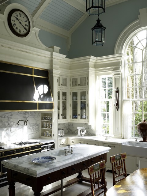
A Bright and Airy French Kitchen
May 16, 2012 § Leave a comment
I adore this, specifically the beautiful windows. I can just imagine myself sipping on a cold glass of somethin’ in the summer time and eating that juicy watermelon.

Color Inspiration: Succulents Succulents
March 22, 2012 § Leave a comment

via. Style Me Pretty

via. Piece of Shell

via. Black Bird Experience on Etsy
